Managing Content
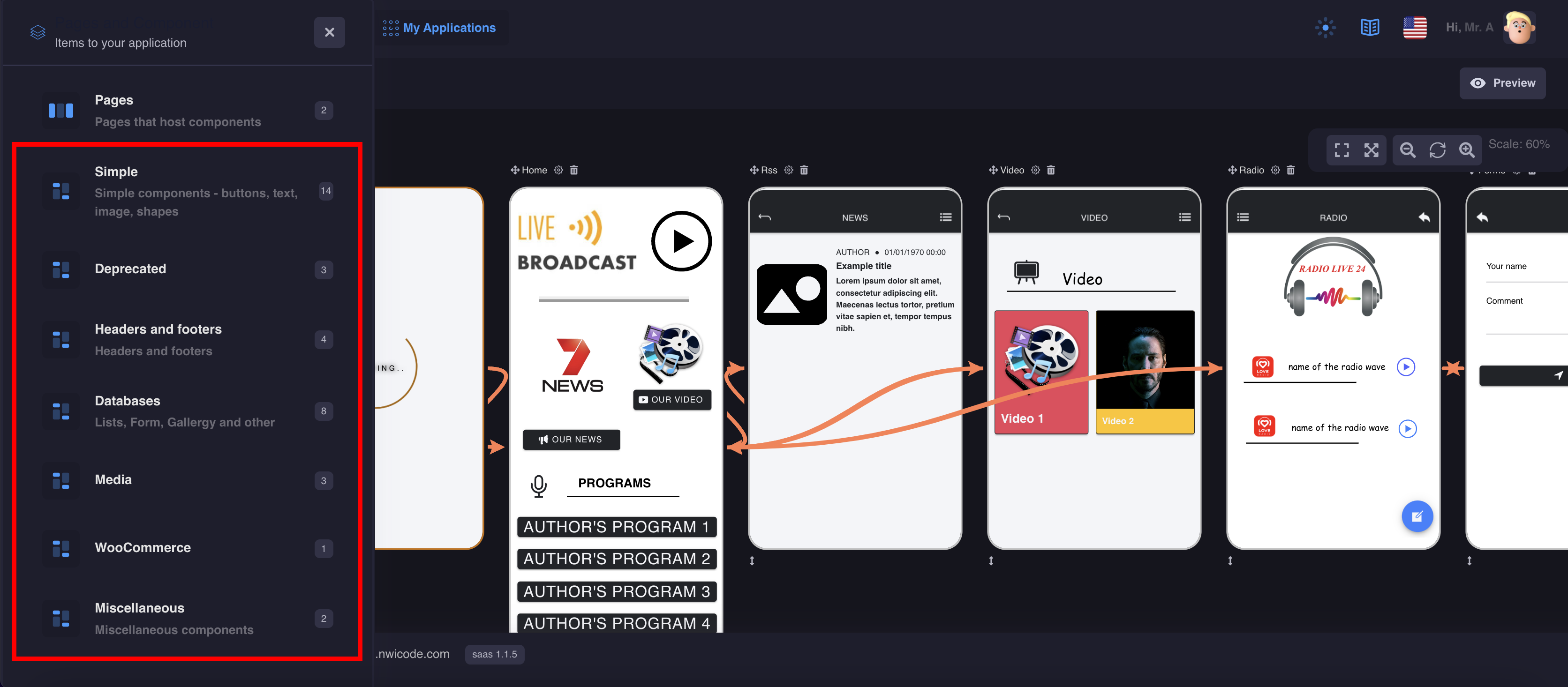
Components
Components
Components are used to customize the design and functionality of your pages
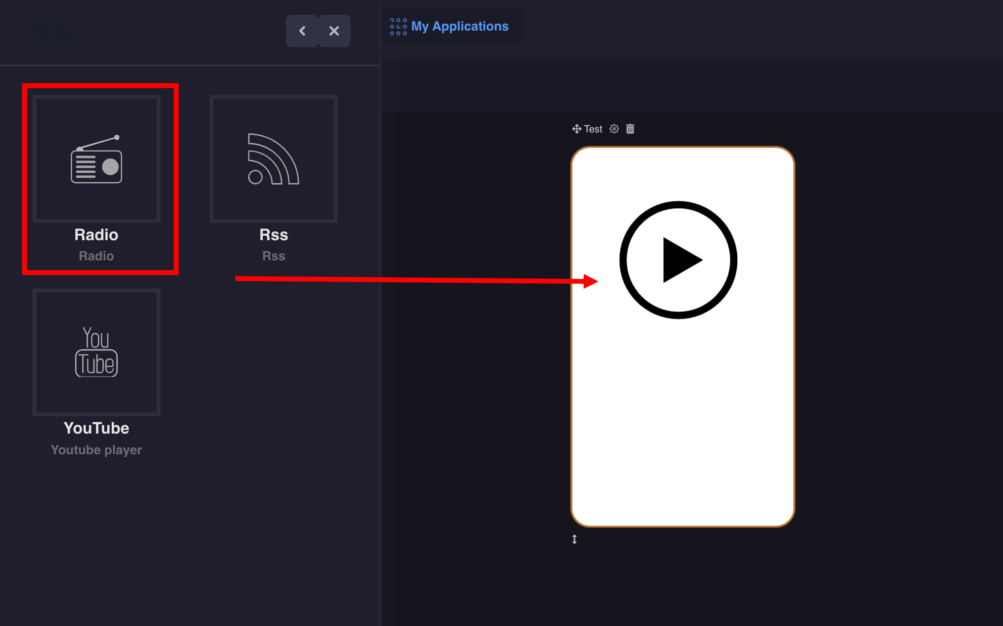
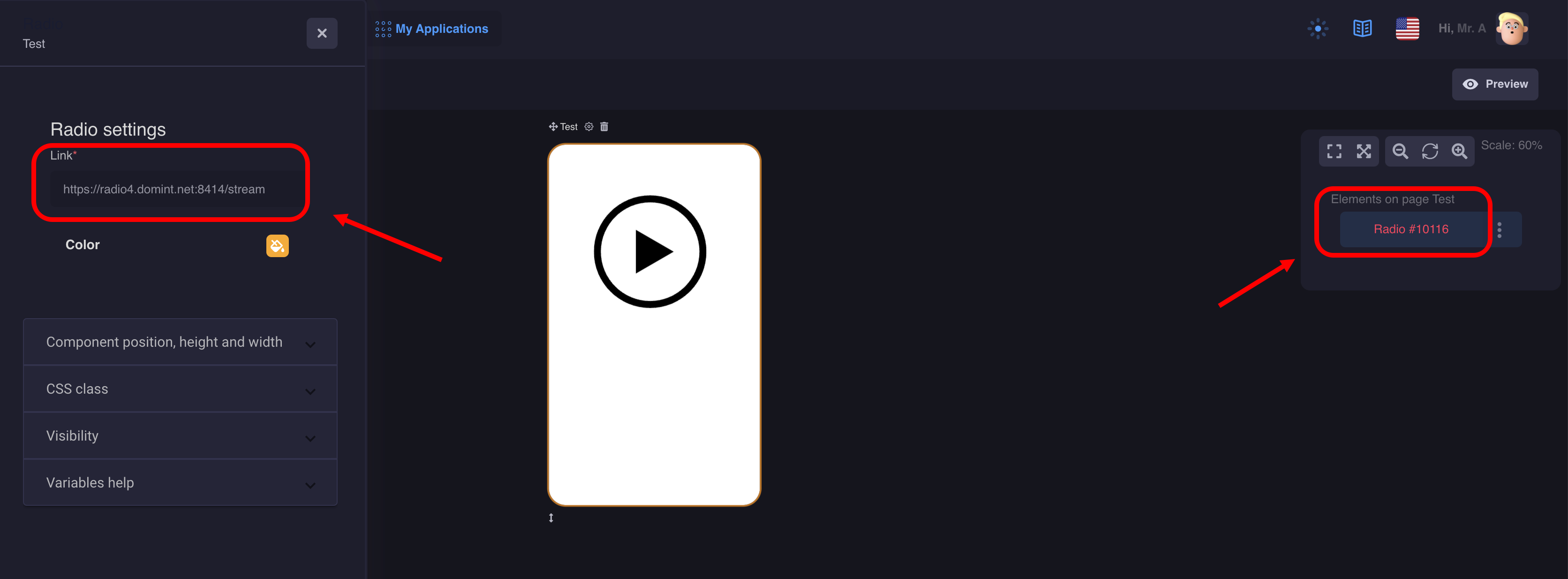
1. Radio
Using the Radio component, you can add streaming radio to your application. The component looks like a simple icon when you click on it, playback occurs.
It's very easy to set up, but you need the right streaming URL.
Example URL for our "Radio" function :
- https://radio4.domint.net:8414/stream
- https://streamer-01.rtl.fr/fun-1-44-128
Note:

Since Apple is requiring apps to use IPV6 networks, streams URL needs a domain name and not an IP to work properly on iOS : https://www.hosting-serv.com:9110 rather than https://62.210.36.44:9110/

Note:

The AACP/AAC+ audio format is not supported by Mozilla Firefox web browser. If the Radio feature does not work, check that you are not trying to open a AAC+ stream with Firefox. It works perfectly with Chromium/Chrome.

Note:

Android 9 requires now that all URL use https, so stream URL must use https
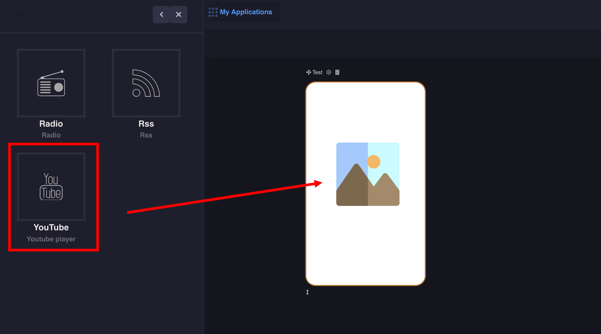
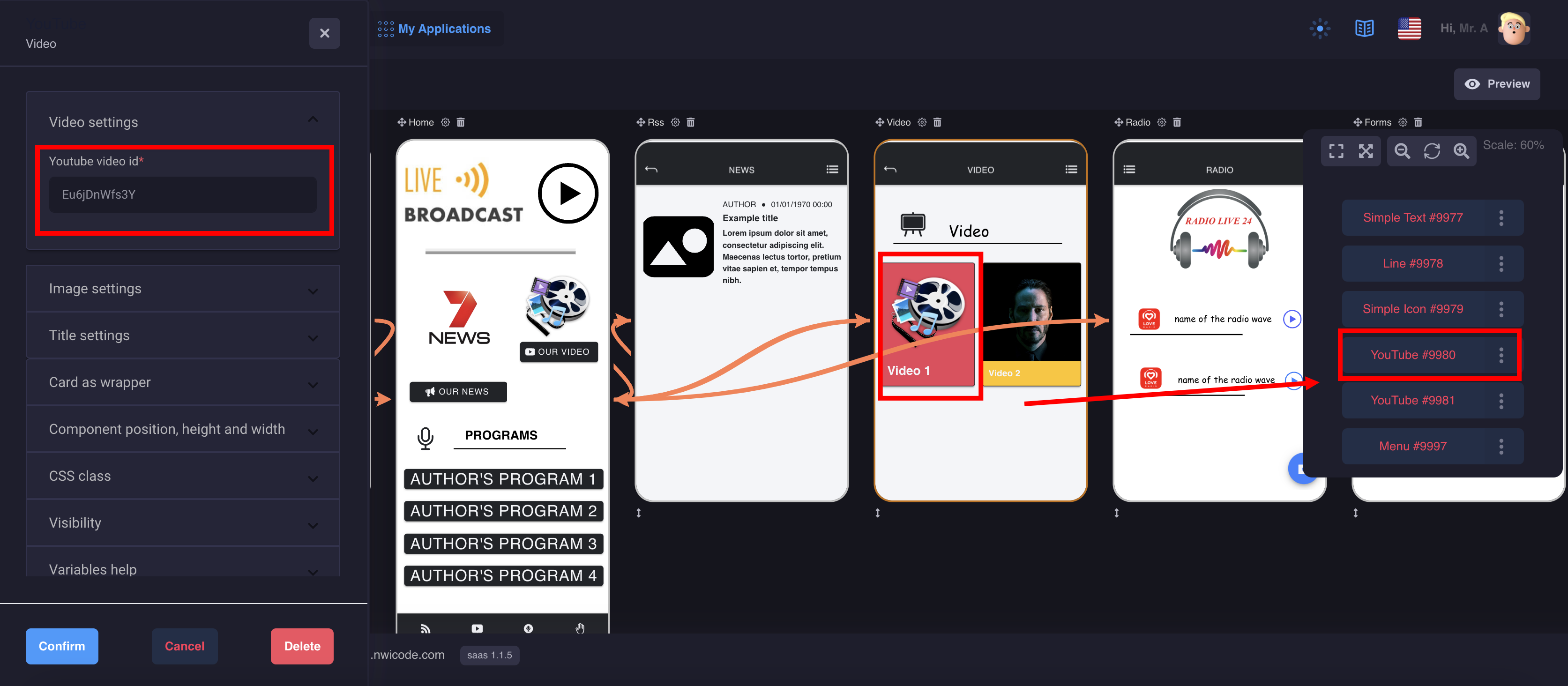
2. YouTube
The YouTube component allows you to embed your video
Example: to insert a Youtube video https://youtu.be/Eu6jDnWfs3Y you only need the video ID — " Eu6jDnWfs3Y ".
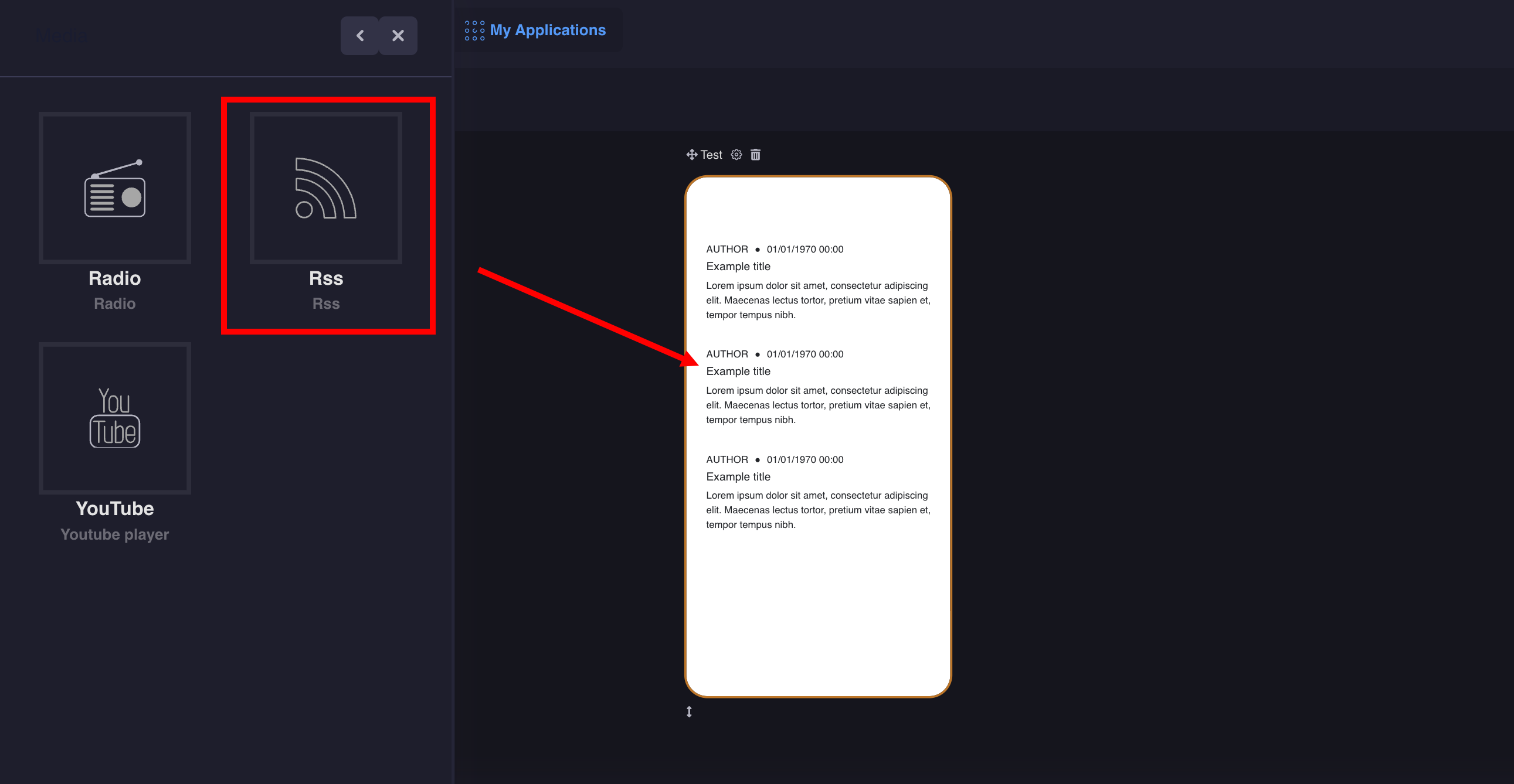
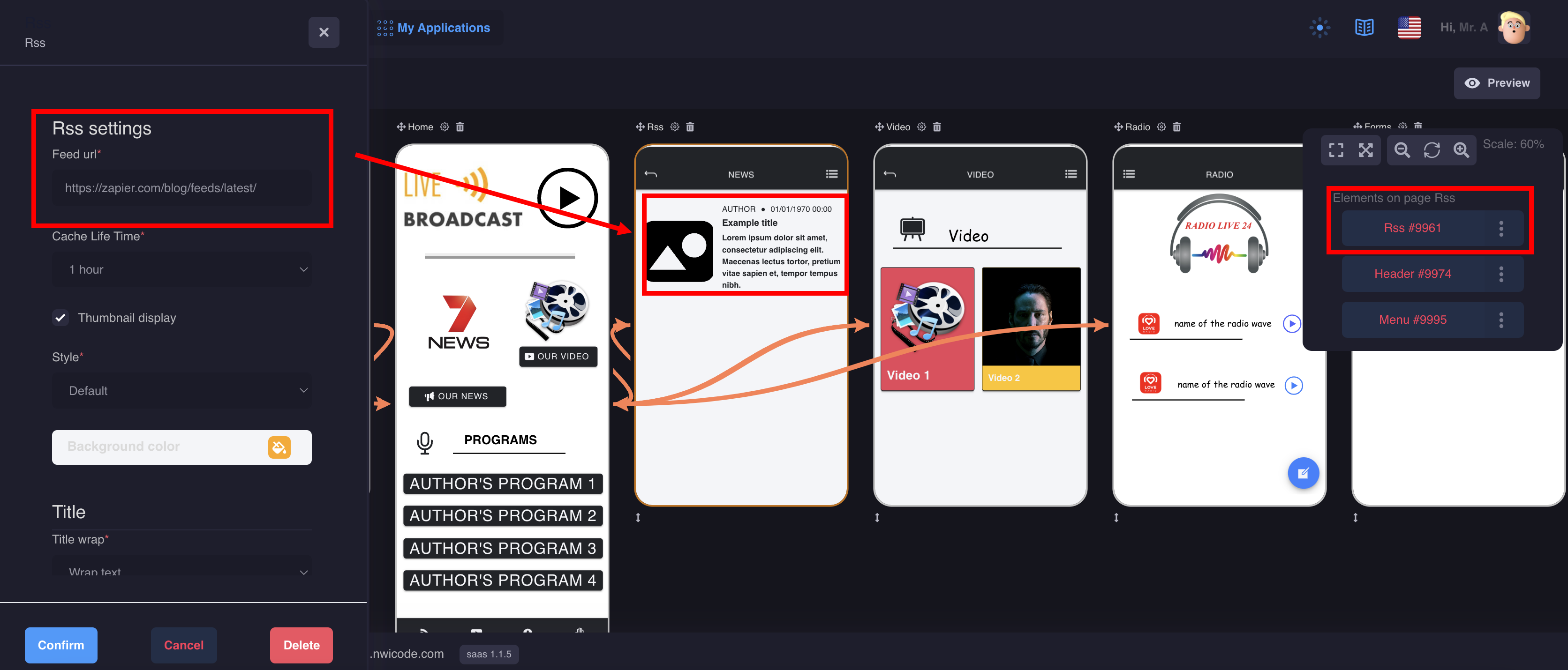
3. Rss
This feature allows you to integrate feeds from blogs or news websites either from the business for which you’re creating the application or other sources in relation with the business or both.
Example: RSS insertion link https://techcrunch.com/feed/
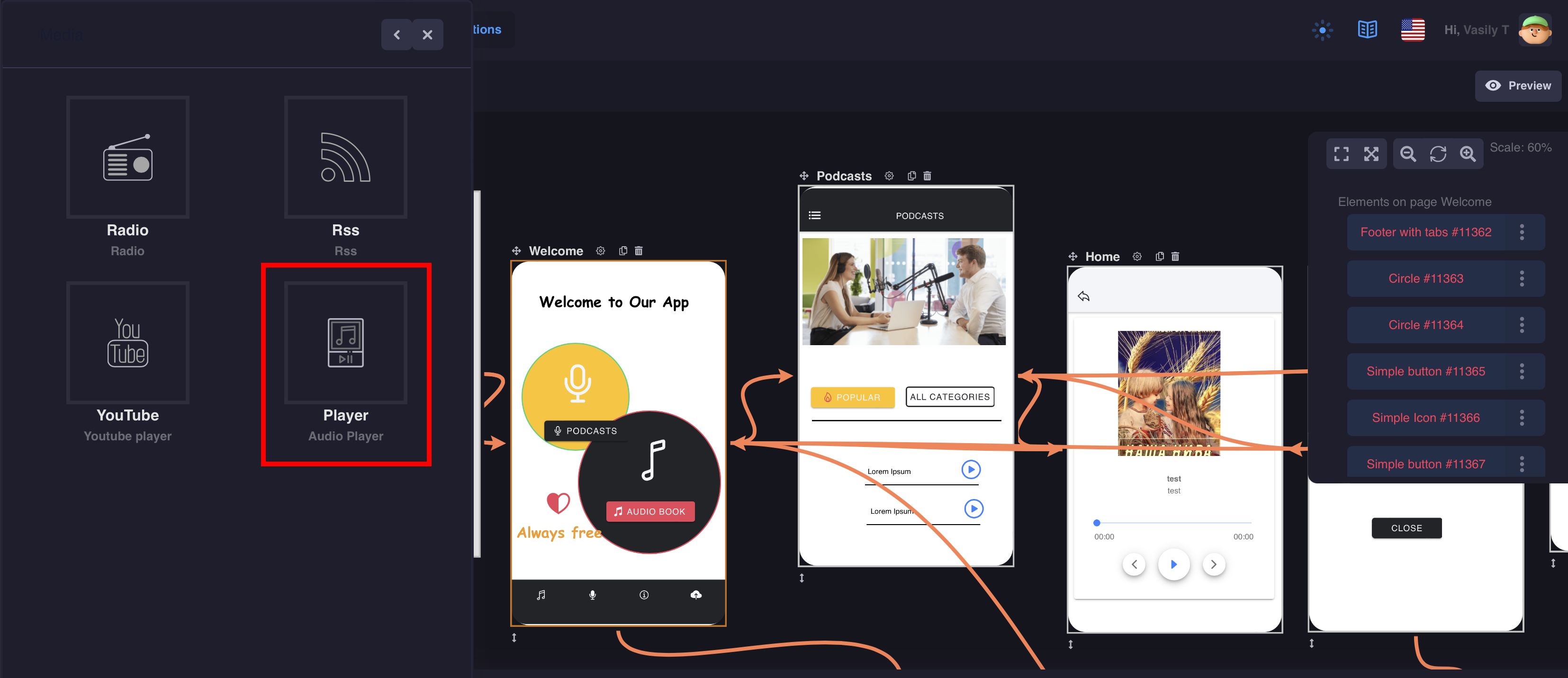
3. Audio Player
The player is designed to play audio in your application. You can create podcasts, audiobooks, etc.
To configure you will need a link to your audio file: Song Url * (https://example.com/song.mp3)
and a link to your cover image Album Url * (https://example.com/image.png)
The page screen can be divided into three parts: Header, Footer and Side Menu. You can use the components all at once or separately.
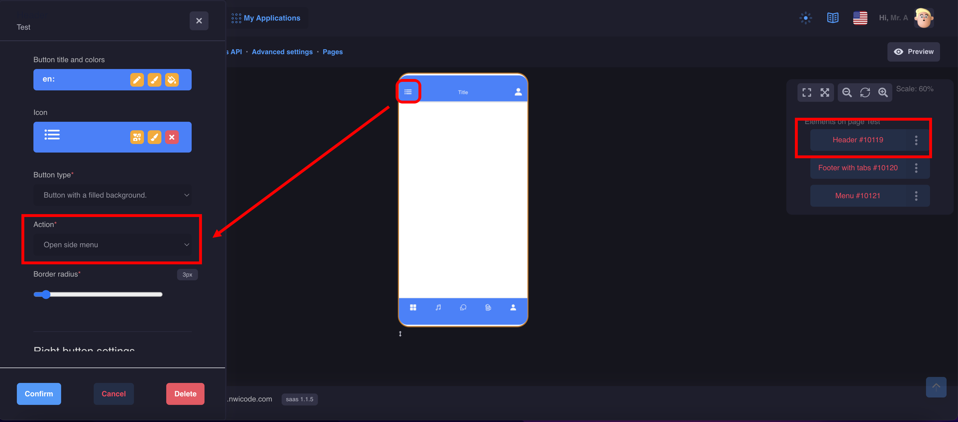
Header
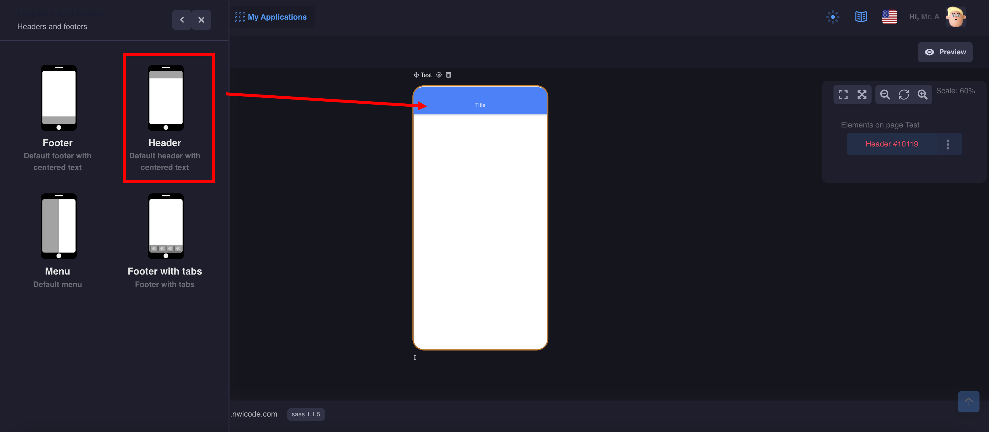
Drag the component to the page and proceed to its settings.
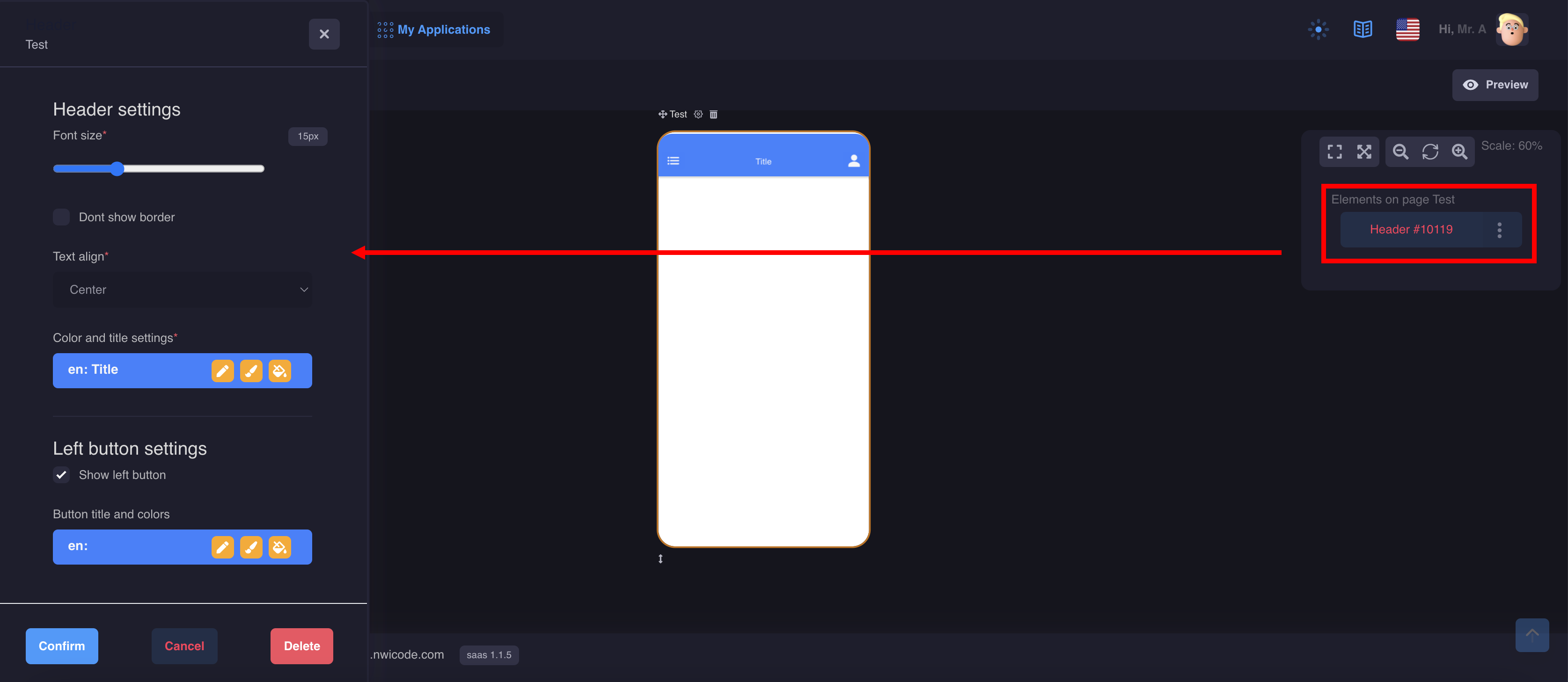
You can customize the header for your design:
- Customize the color
- Add an icon on the left and right
- Set an action
Footer
There are 2 components with different design options
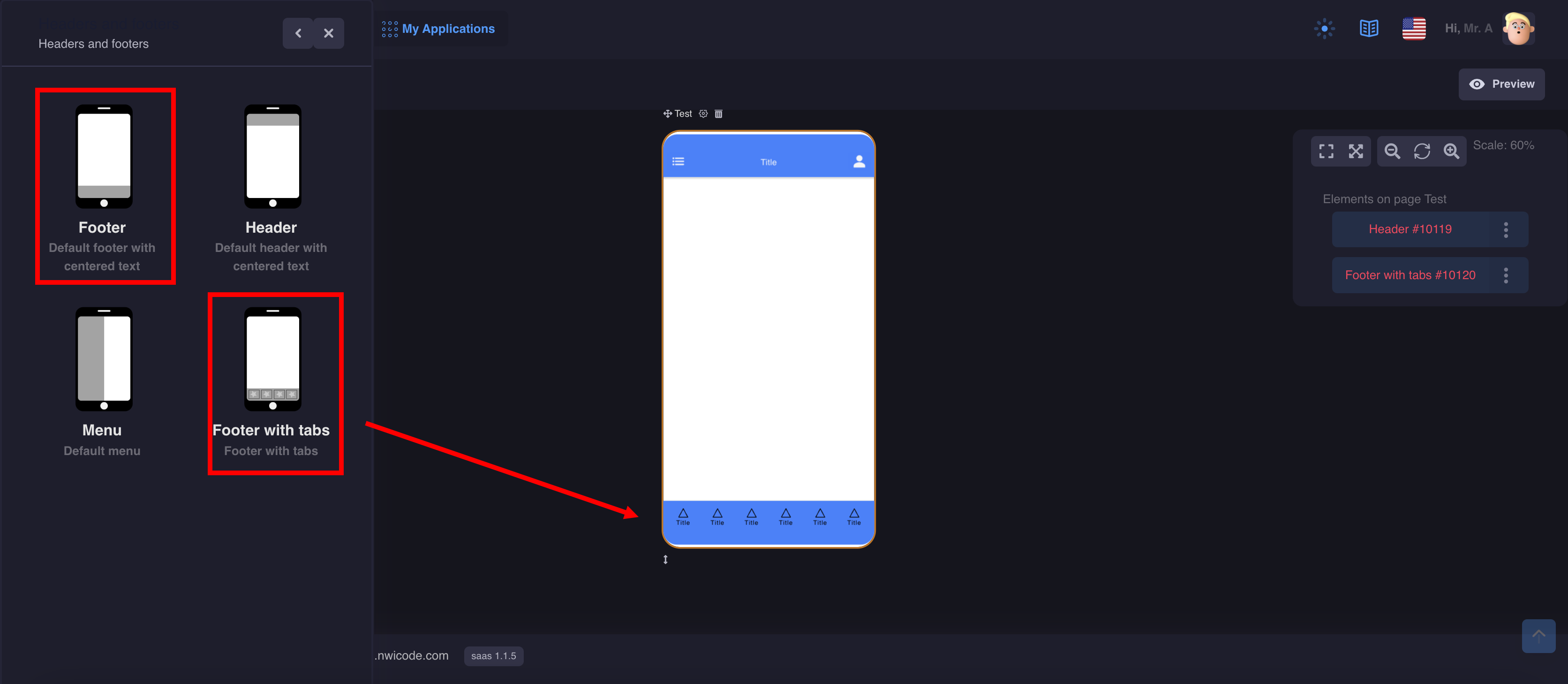
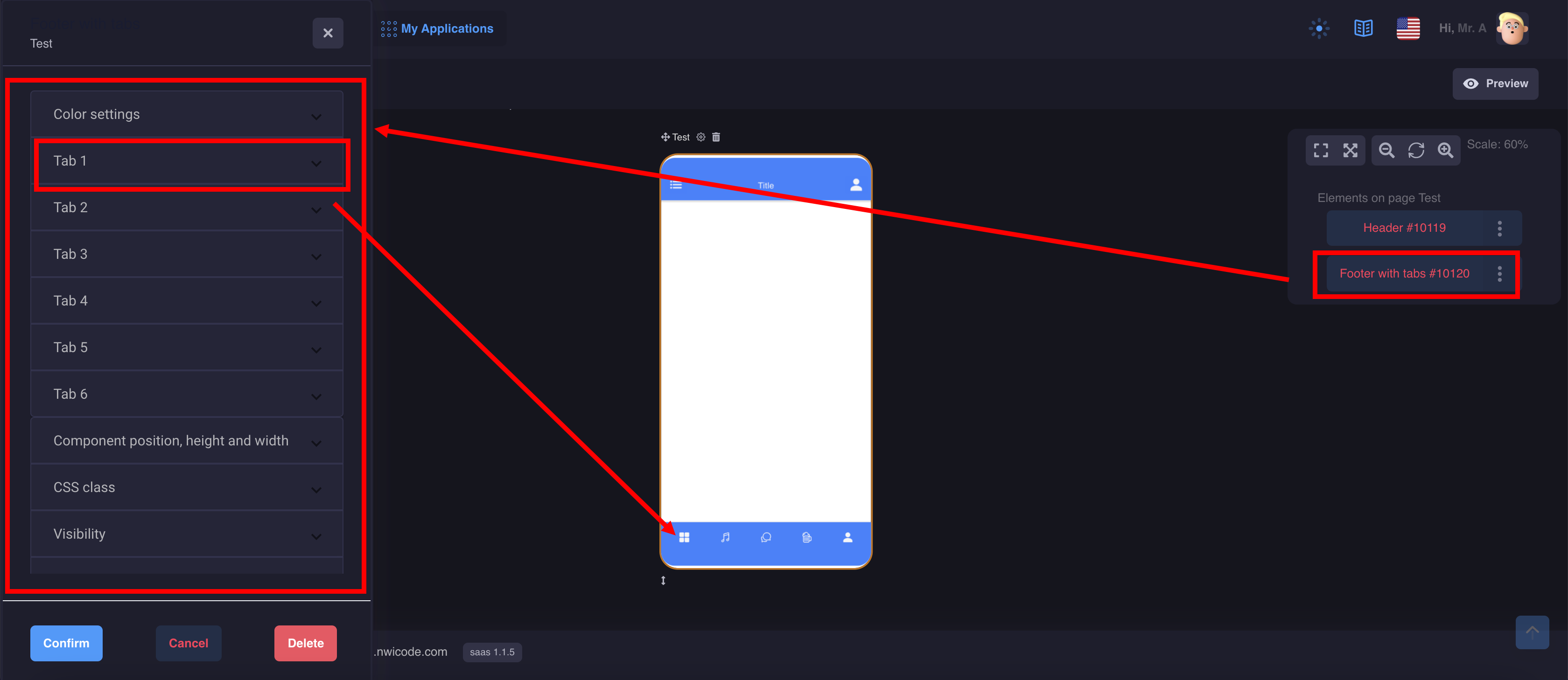
You can customize the footer for your design:
- Customize the color
- Add up to 6 tabs
- Configure Actions
Side Menu
Note: When a component is added to the screen, it is not displayed visually
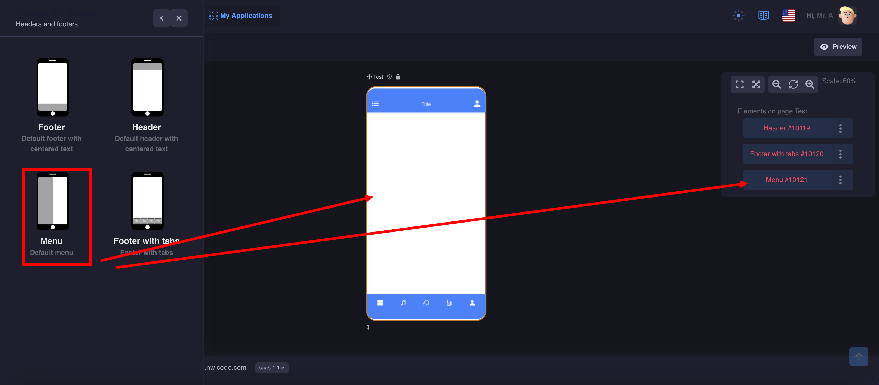
Menu settings and styles are made in the component itself
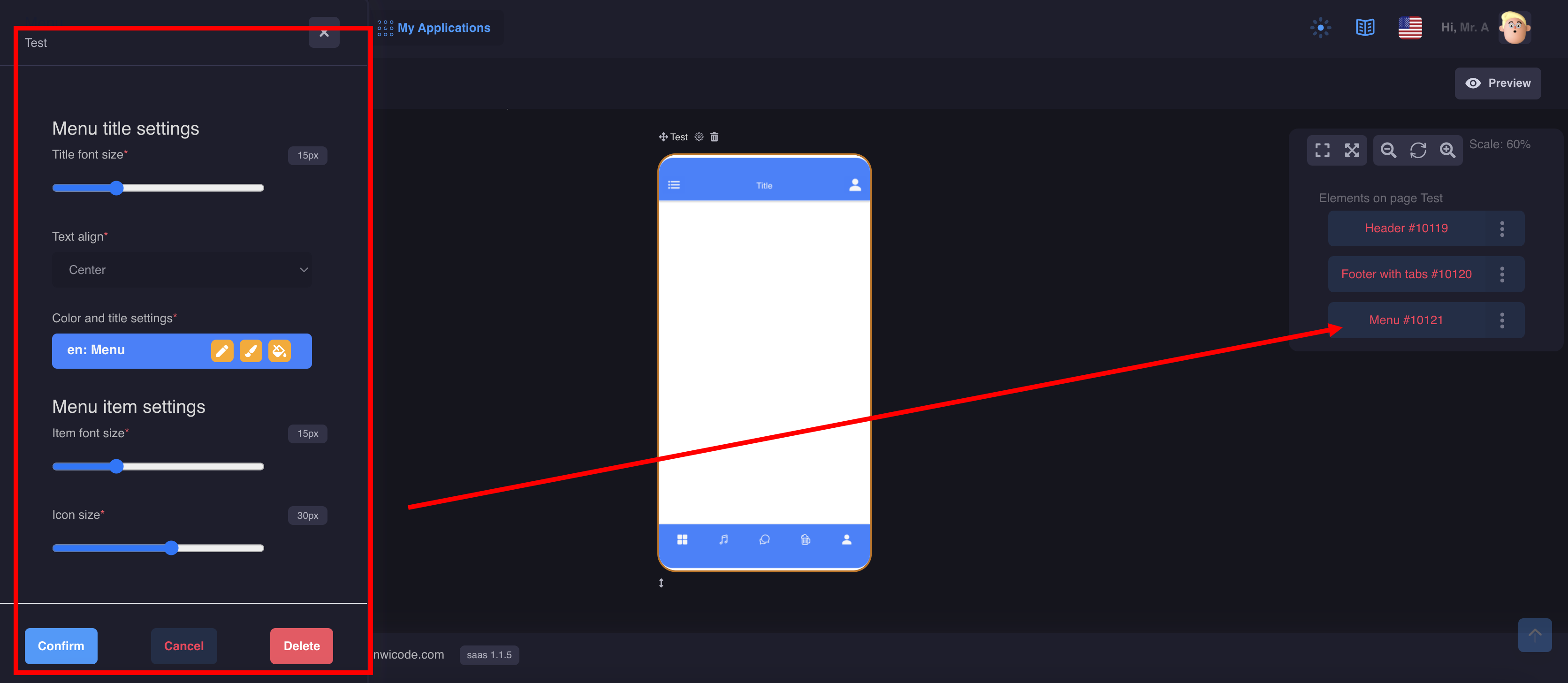
Menu items are created on a separate page
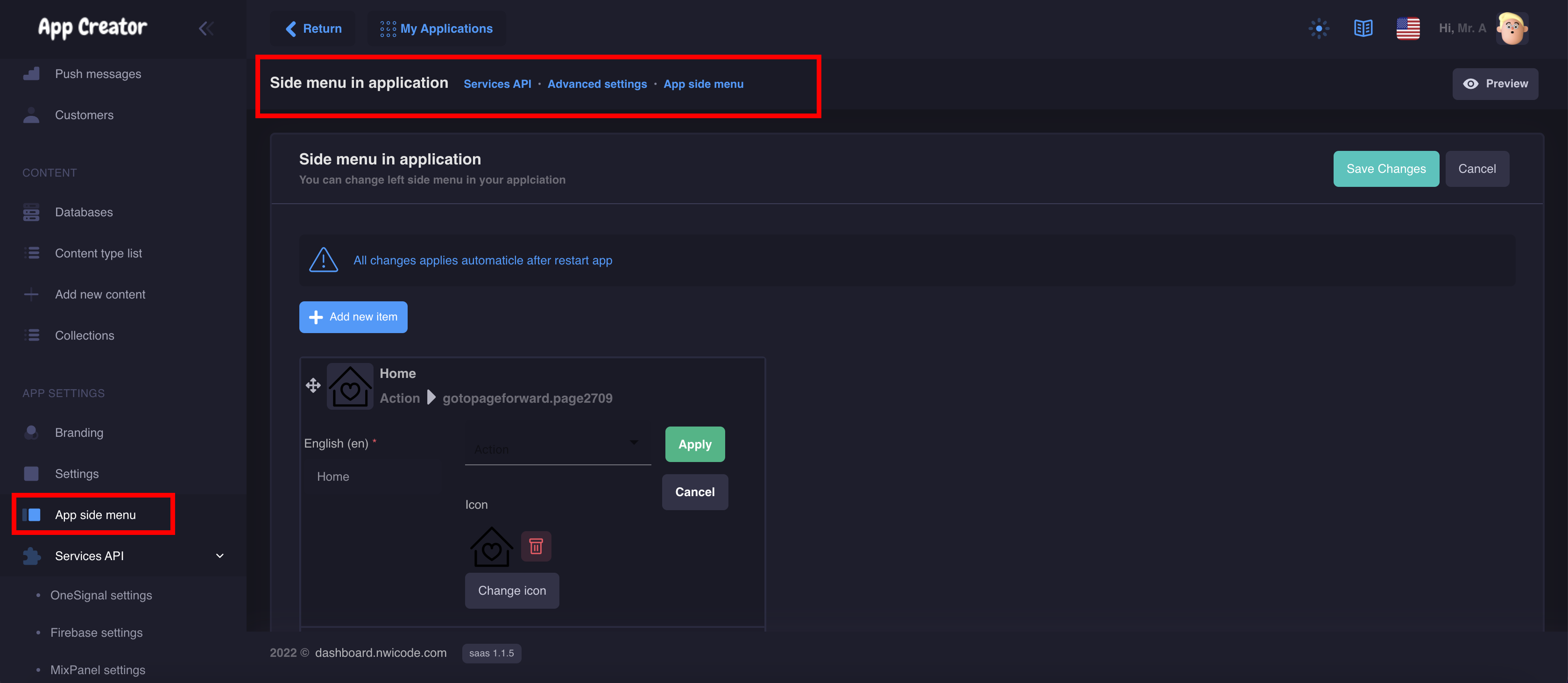
To open the side menu, you can set an action in the header, footer, or button settings.
Note: Make sure that you have added the side menu component to your page, otherwise the link to the action for the side menu will not be displayed in the settings
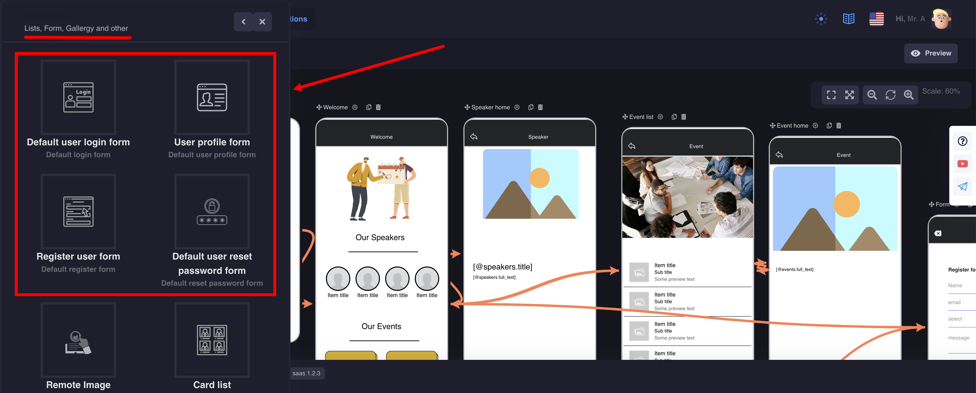
Database components are designed to work with dynamic content
1. Registration and authorization of users
There are 4 components that you will need to set up user authorization:
- Default login form
- Default user profile form
- Default register form
- Default reset password form
So, for each component we will need to create 4 screens and set actions.
Let's see how it works with the registration component example:
- Adding a new screen
- Drag the Default register form component and the button component onto it
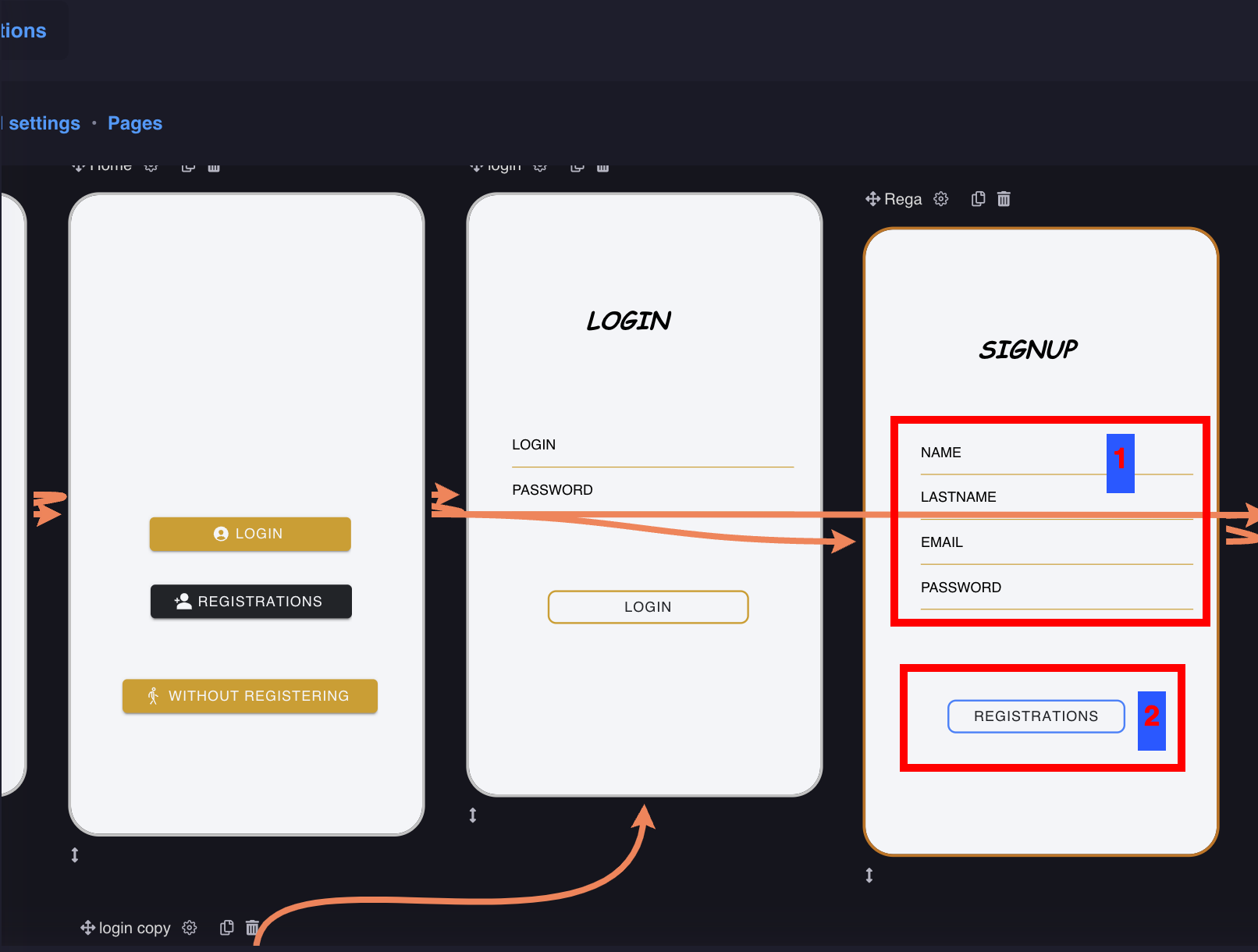
Go to the settings of the registration component:
- Customize the style of text and lines
- Specify actions to be taken after successful or unsuccessful registration
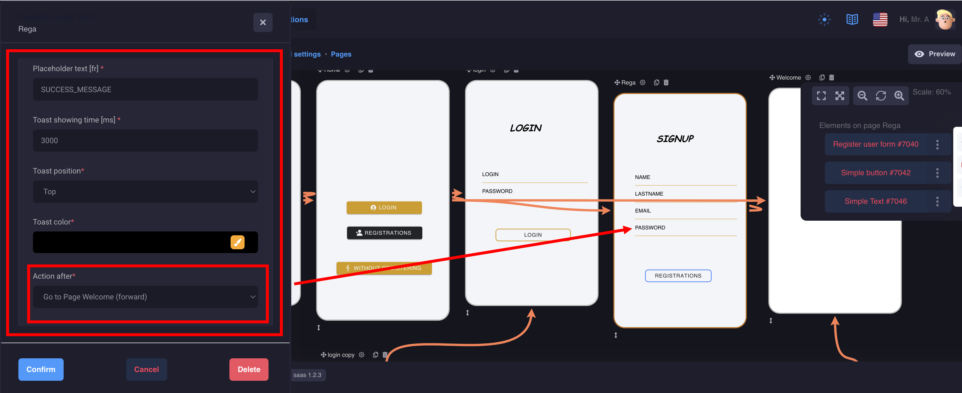
You need to fill in a message that the user will see after the action is completed, as well as where he will be redirected in case of successful registration, for example, to your home page or to a closed section of the application
Now, to make it all work, we need to add a button below our form and set an action:
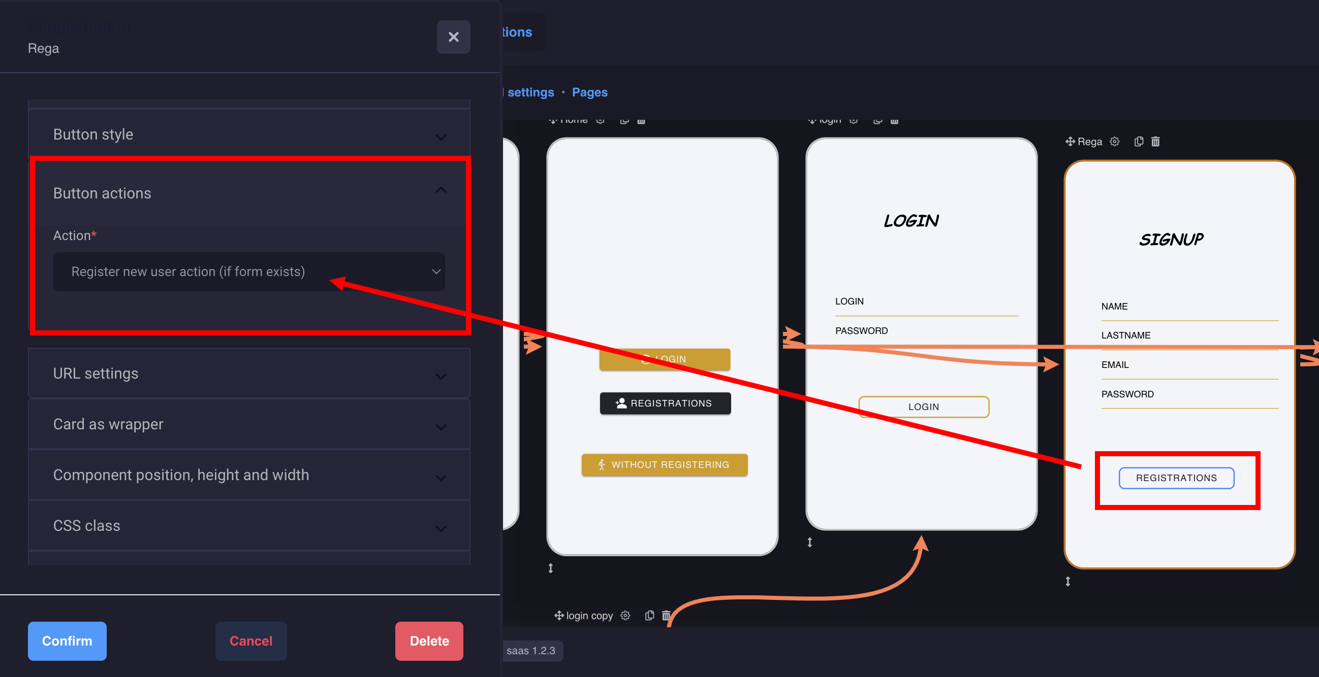
Select from the drop-down list: register user action.
That's it, you did it!
Now do the same with other components for user authorization. You can also add pictures or texts to your screen to make your design more unique and attractive.
2. Card list, Row list, Avatar list
This is a list of components that will render dynamic content from your database. The components differ only in design and have the same settings.
Let's look at an example of settings on the Card list component:
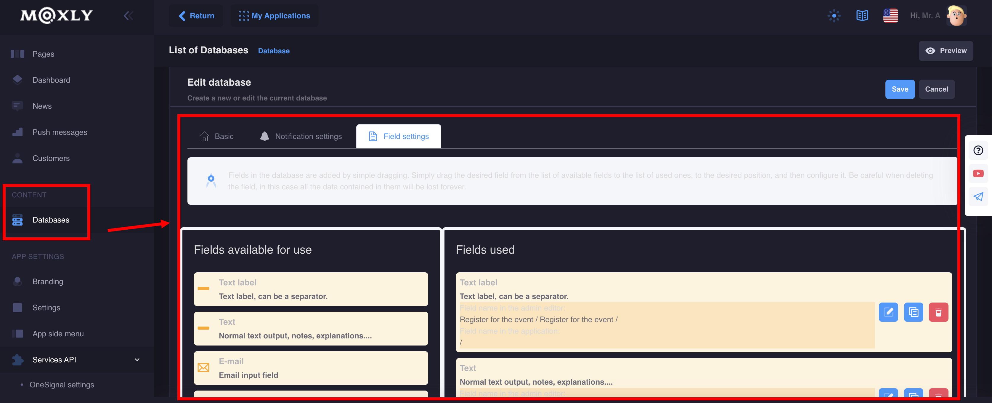
Note: before adding screens with the settings of these components, we recommend preparing the database and content
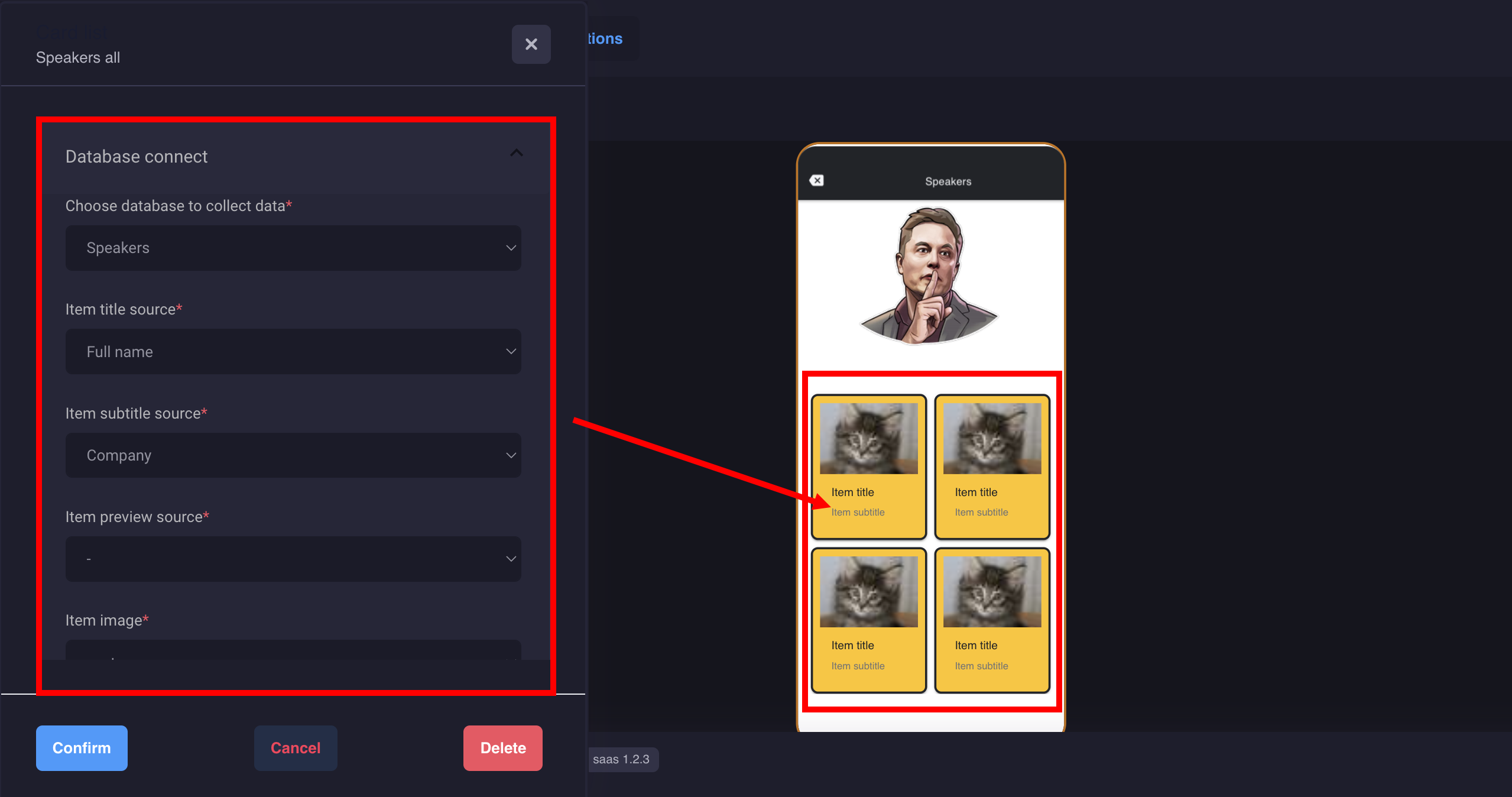
Select the desired database and which records should be displayed in the preview card, for example: name, subtitle, photo, etc.
Customize the design and appearance of the display on the screen. Set the action to be performed when clicking on the card.
That's it, you did it!
3. Remote Image, Text
Page for displaying content and images from the database
Remote Image: displays your icons or photo gallery with sliders
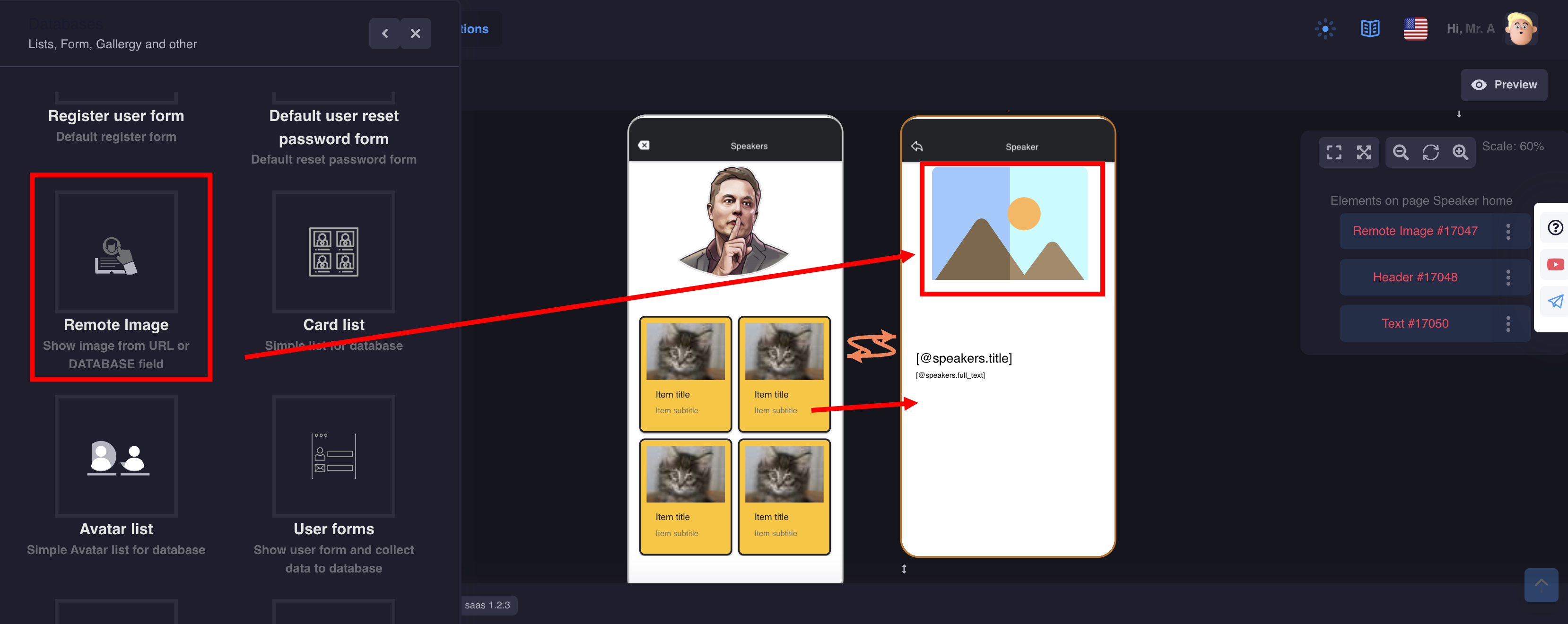
Configure the connection to the desired database
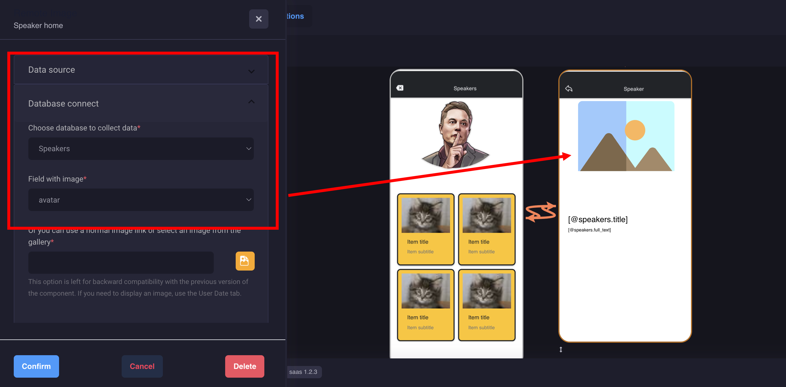
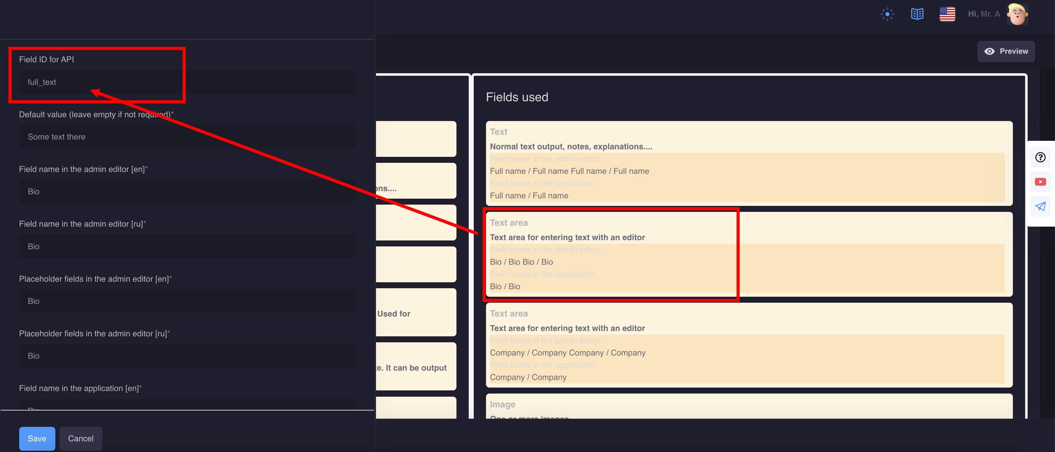
2. Text: output dynamic content
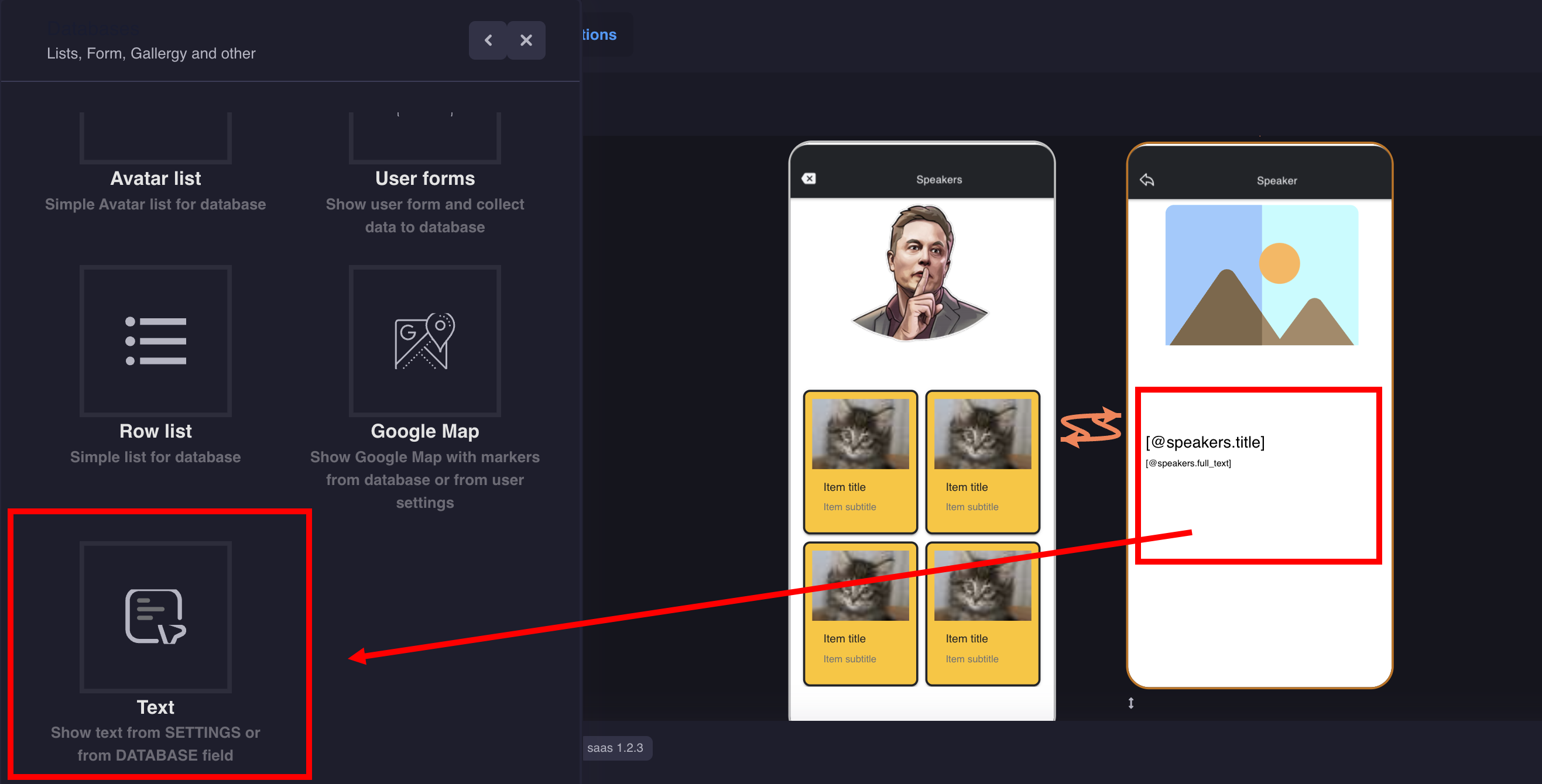
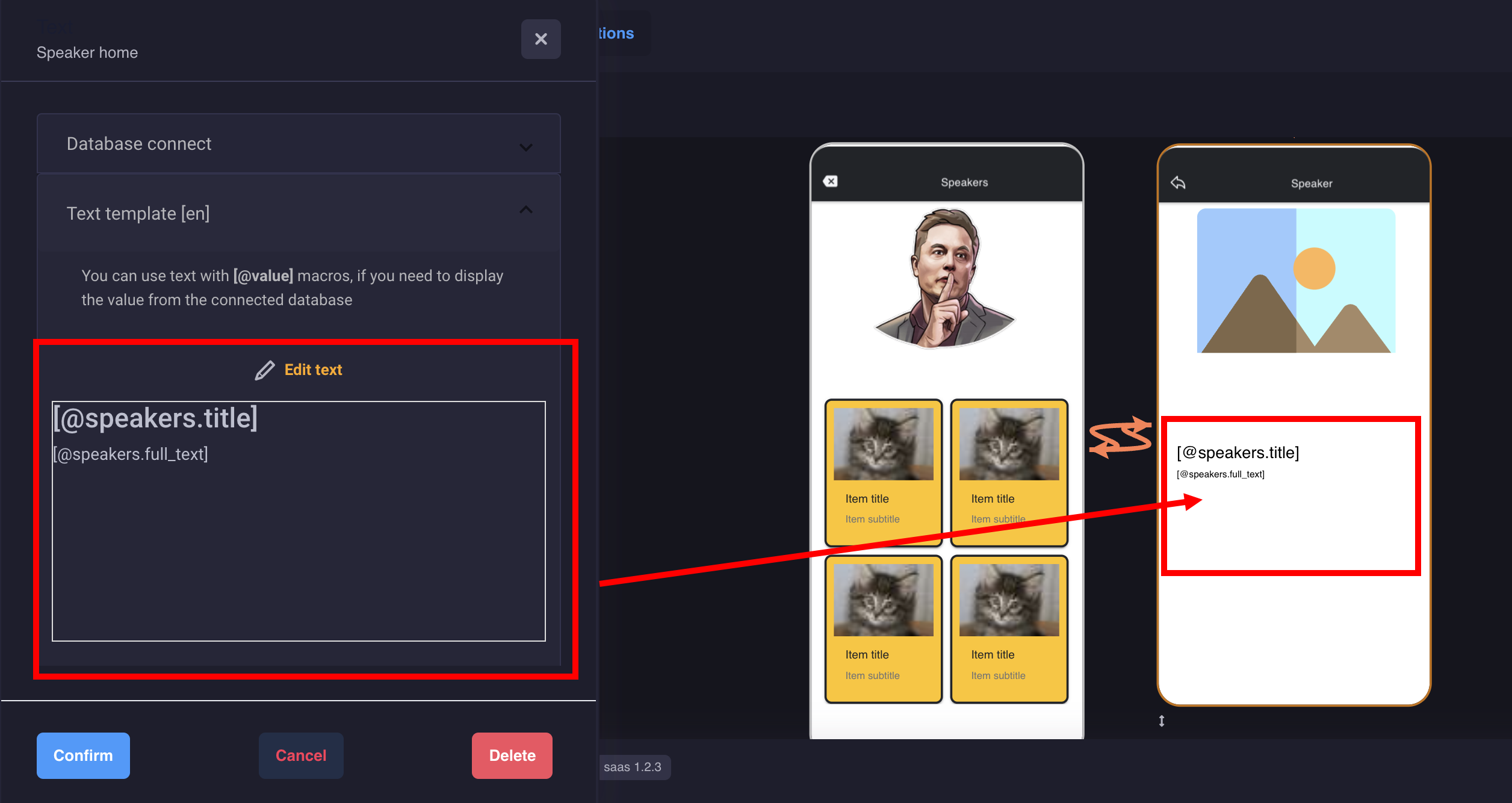
You can add several components with text and connect to the database with a separate field, or you can use the macros that you prescribed when creating fields in the database
That's it, you did it!
Here is how it will look on the device:

3. User forms
User forms are designed to collect applications, feedback, etc. that you want to receive from your users in the application
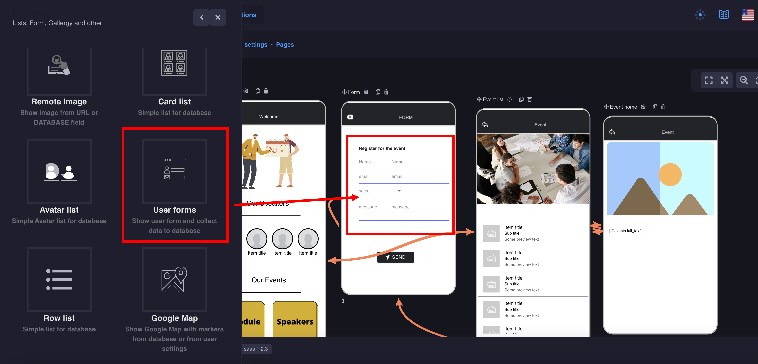
1. Prepare the database with the required form fields
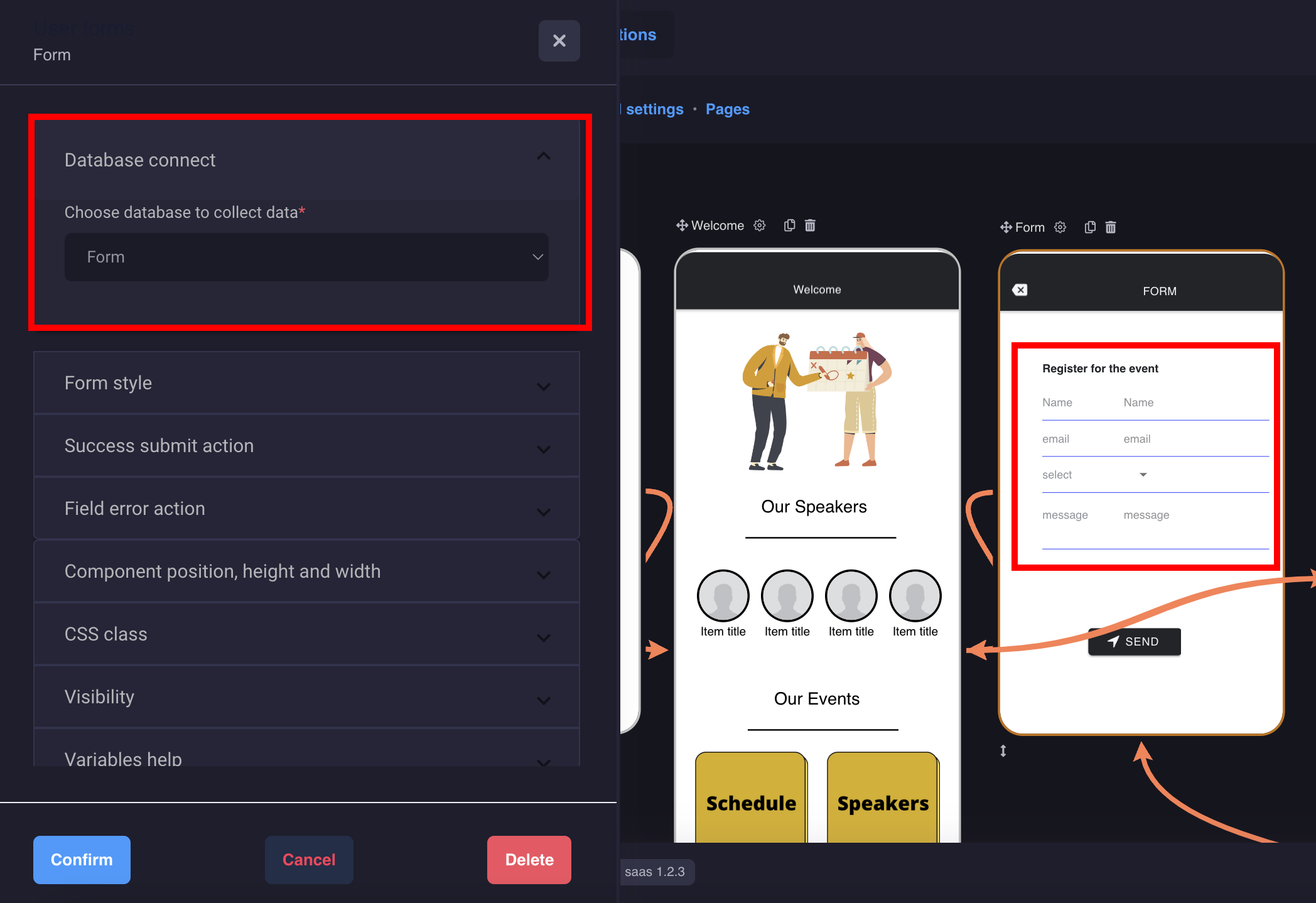
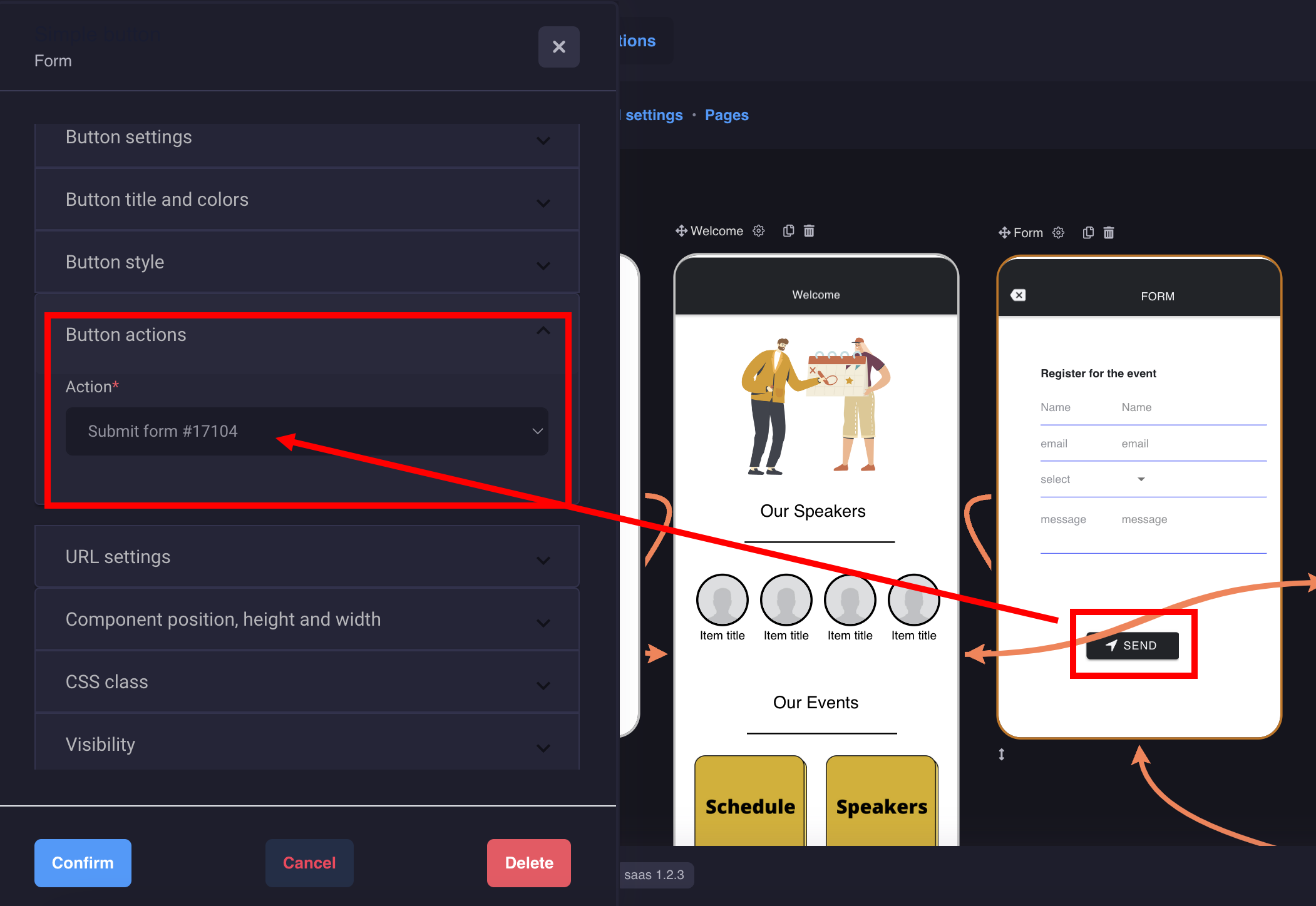
Add a button and set an action
You will receive notifications to your email and you can also manage messages in the database settings
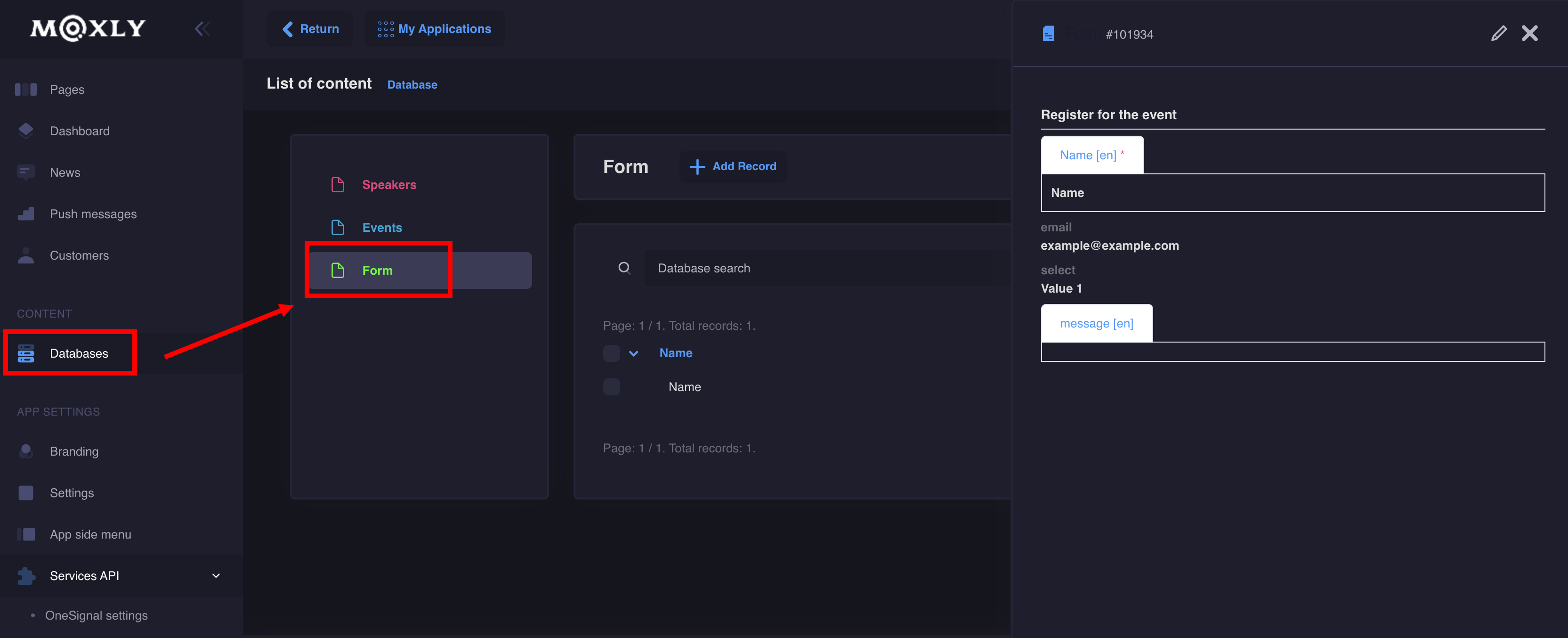
That's it, you did it!
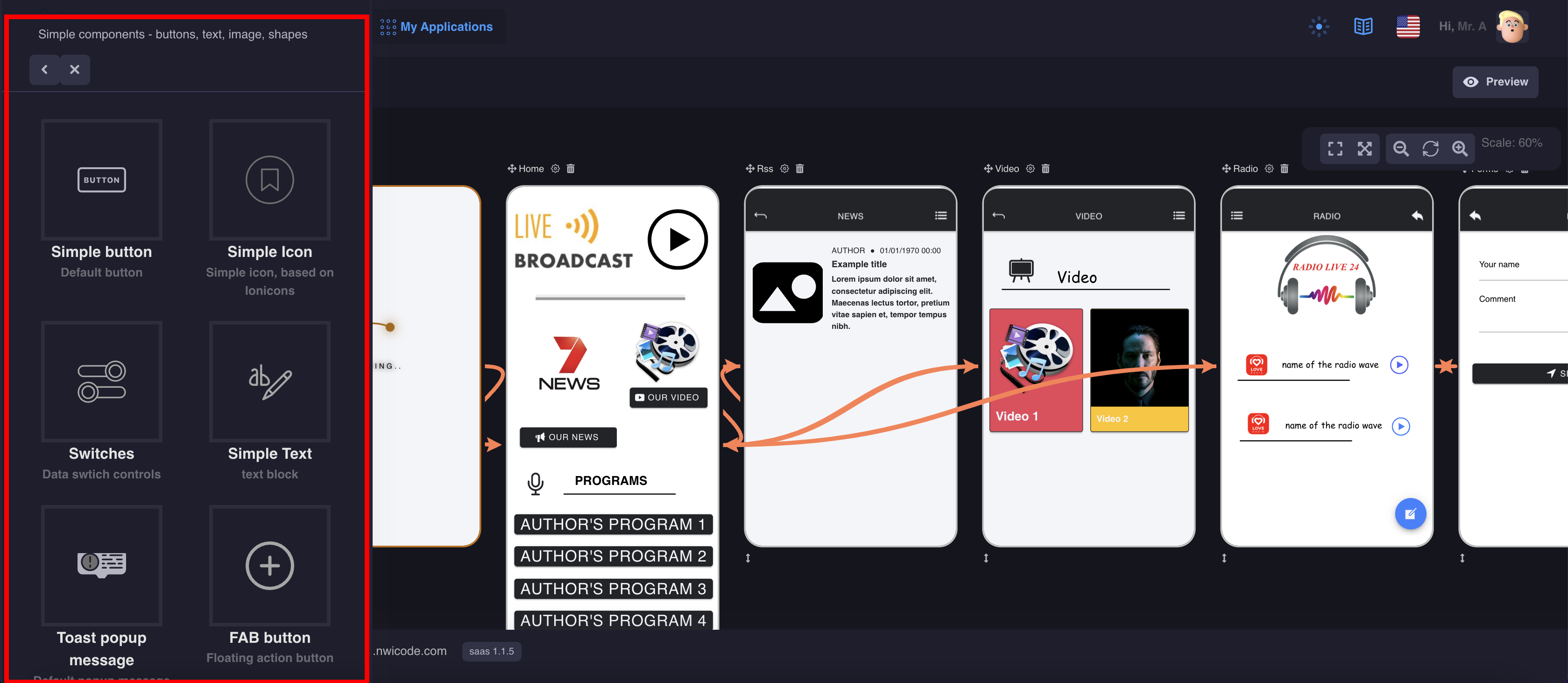
Simple components - buttons, text, image, shapes, pop-ups, etc
1. Popover window
Popover component is used to manage the presentation of content in a popover. You use popovers to present information temporarily. The popover remains visible until the user taps outside of the popover window or you explicitly dismiss it.
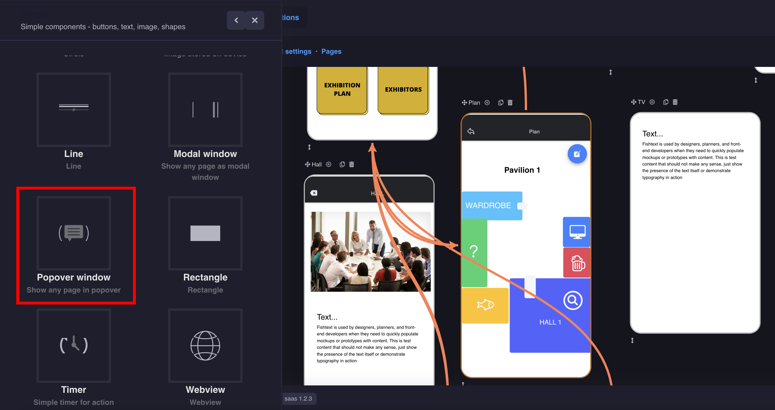
Note: The component is invisible on the page
Settings:
- Add a component to the screen where your messages will be displayed
- Create a new page with text for your message
- In the Popover window settings, set the action
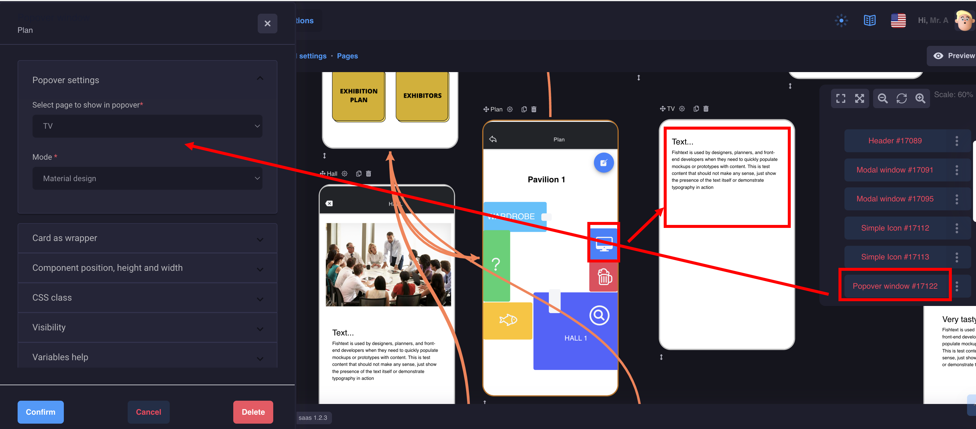
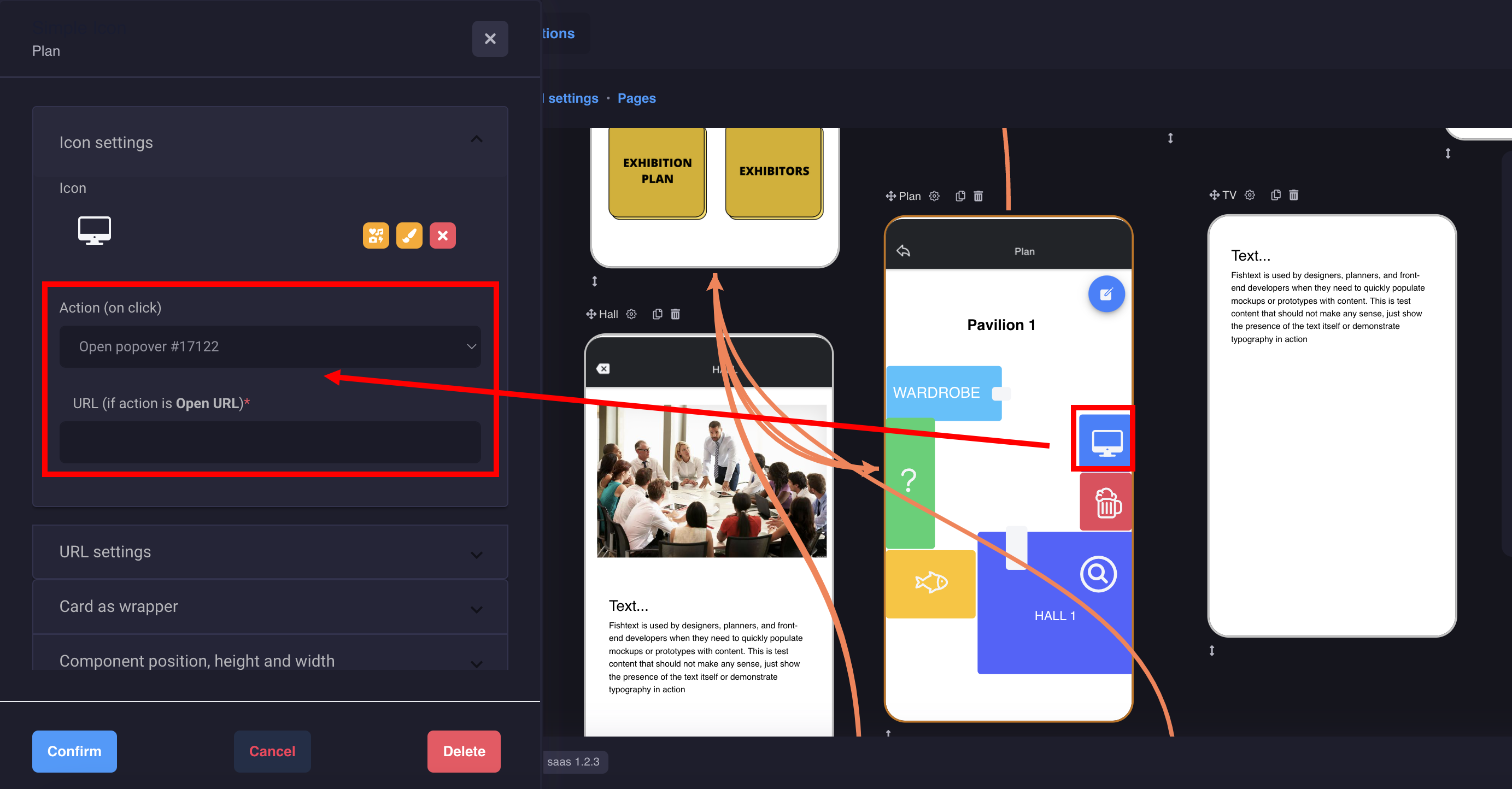
This is how it will look on the device:
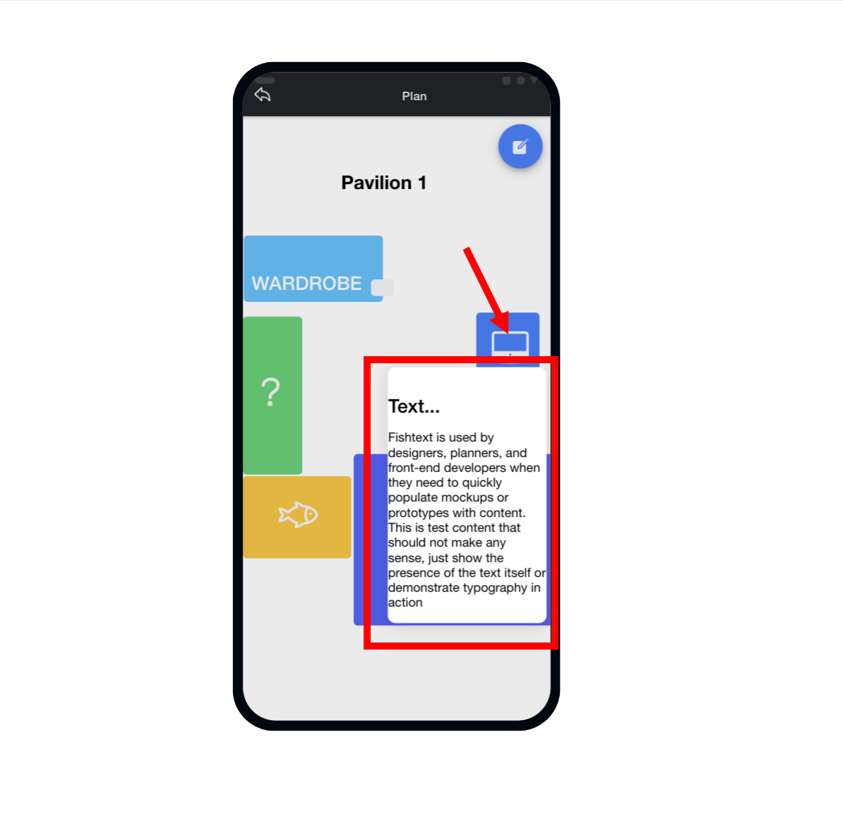
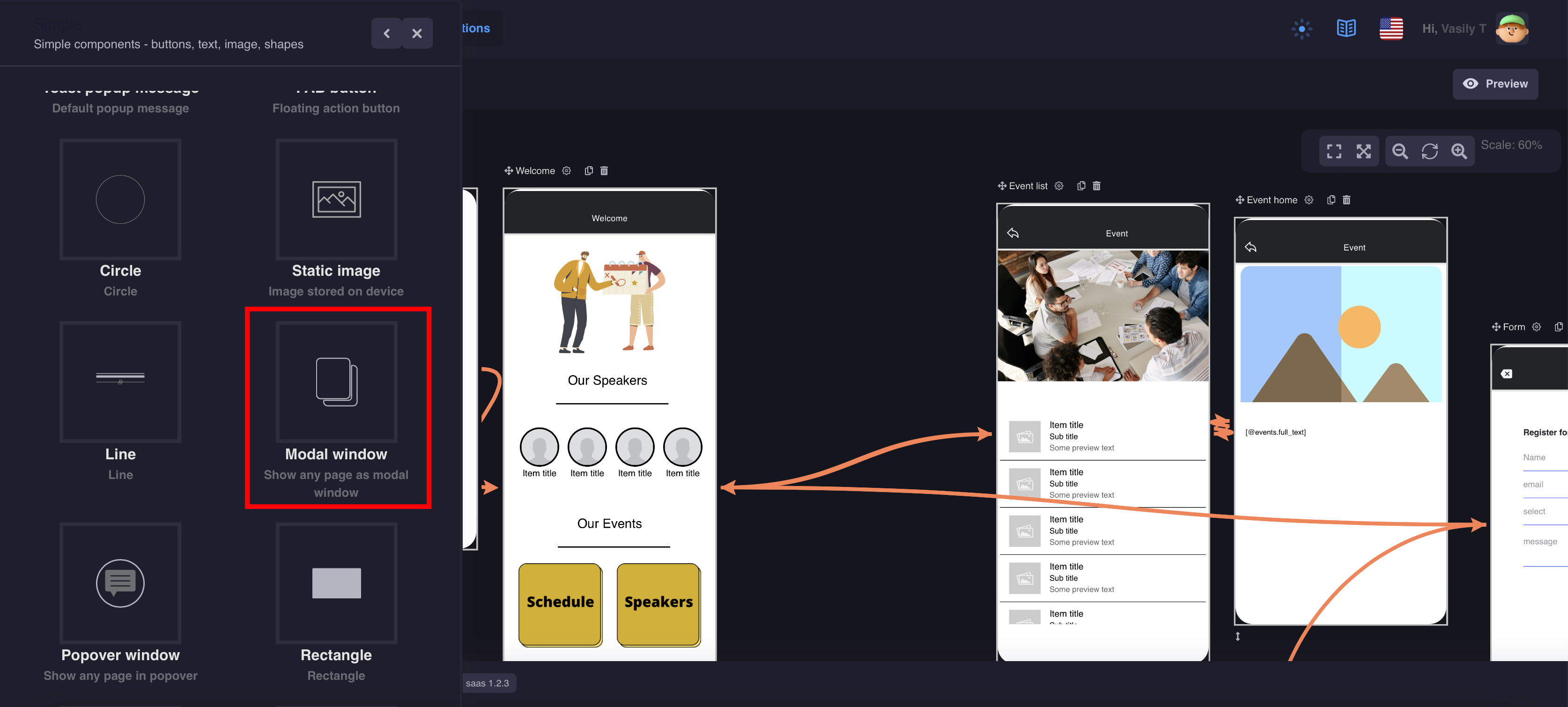
2. Modal window
A Modal is a dialog that appears on top of the app's content, and must be dismissed by the app before interaction can resume. It is useful as a select component when there are a lot of options to choose from, or when filtering items in a list, as well as many other use cases.
Note: The component is invisible on the page
- Add components to the screen where the modal window will open (if you use different pages with content, then you need to add several components)
- Prepare a separate page with your content
- Configure the actions. Don't forget to make a button on the page to close the modal window
2. Webview
WebView is a component of the Moxly platform that allows embedding web pages into mobile applications.
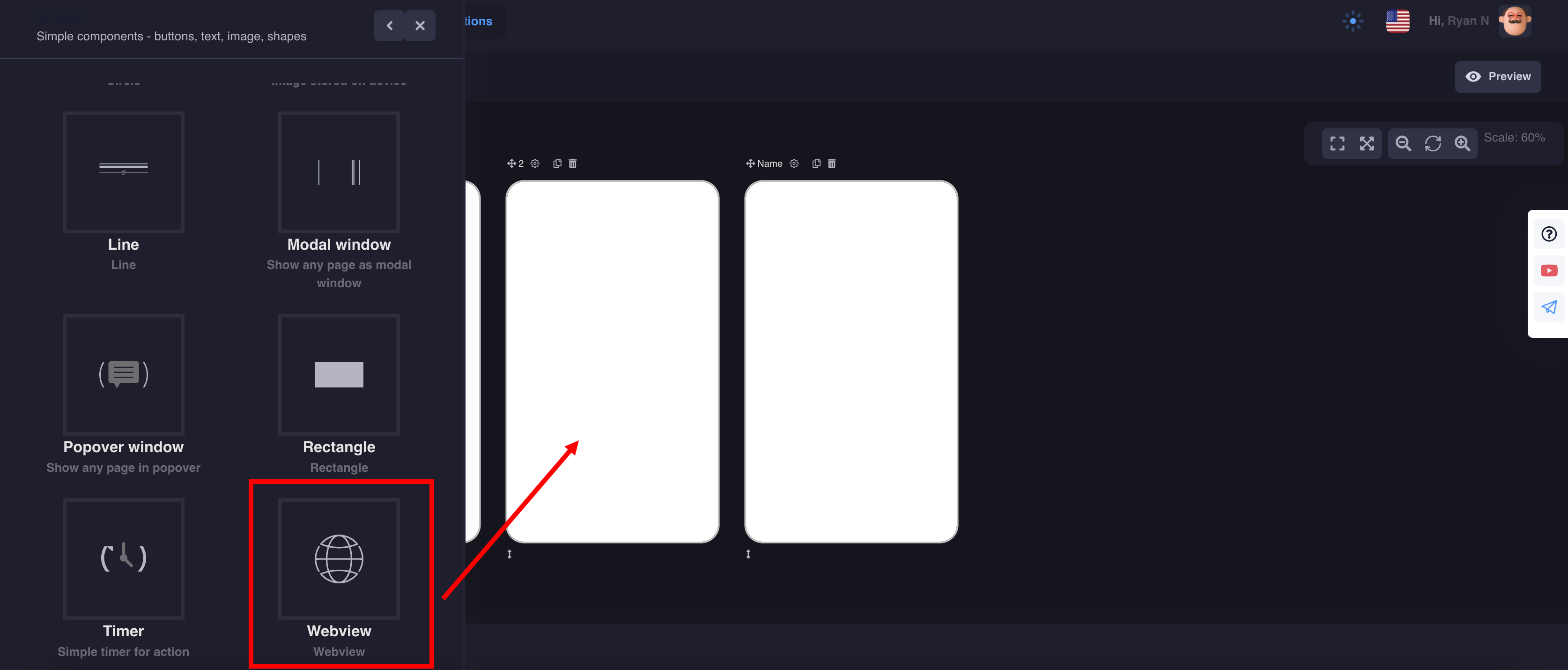
In order for your website to work in the mobile version, the site must have an SSL certificate and open to display in a frame
You can use macros from the database for use in the Webview component.
No need to add many components and new screens


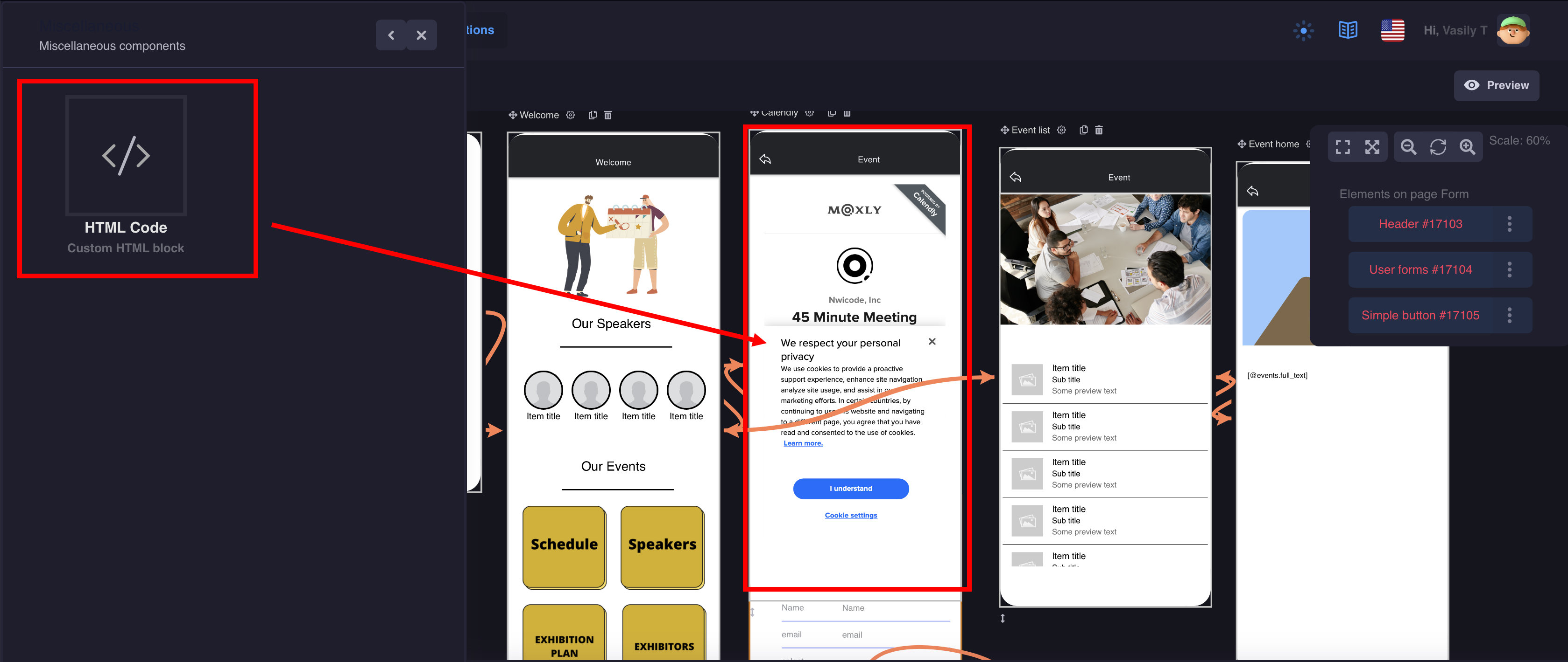
HTML Code
Custom HTML block with Javascript support
You can add any widgets and scripts to your application.
Let's look at an example widget from Calendly: